Case Study · UX Research & Redesign
Cutting Churn by Rethinking Onboarding
Users were signing up and getting started with their apiary, but dropping off before they'd finished setting up their first hive. That meant they never reached the feature that made the app worth having: hive inspections. The data pointed to a targeted fix, and removing just two screens from the flow was all it took to measurably improve retention.
78.7%
iOS apiary-to-hive completion (60-day avg)
71.9%
Android apiary-to-hive completion (60-day avg)
7.6%
iOS churn at lowest point post-launch
−10pts
Reduction in 90-day rolling average churn
Background
The product, a B2C mobile app for beekeepers, was seeing strong growth — new signups more than doubled between 2023 and 2024 and continued climbing into 2025 — but the growth wasn't sticking. Data showed that 60% of new signups abandoned within the first session before setting up their first hive. This was a clue that we might be asking too much, too soon.
The existing flow asked significant questions about the hive upfront, including hive type, hive setup, and queen details, all of which matter deeply to beekeepers, but together they created a lot of effort before users ever got to do anything. Many were bailing before completing their first hive setup.
Defining the Problem
The drop-off wasn't new. Years of data showed consistent abandonment during hive setup, but the pattern hadn't prompted a specific fix, until the CEO watched a handful of people download the app at a large national beekeeping conference and visibly lose patience partway through the setup flow. That observation, layered onto the existing data, made the problem hard to ignore any longer.
The directive was deliberately narrow: shorten the screens. No extended research phase, no formal testing plan. We had enough signal. The hypothesis was simple, if users could get through setup faster, more of them would reach their first hive inspection, and that was where the app's value became undeniable. The goal was to remove whatever friction stood between a new signup and that moment.
Auditing the Flow
Before cutting anything, I mapped the existing screens against one question: does this information need to live here, or are we asking for it out of habit? Several fields turned out to be useful eventually, but not on a user's first pass through the app. Hive type and queen details, for example, are meaningful once someone is actively managing a colony, but they're friction when you're not yet sure the app is worth your time.
The two screens we removed weren't collecting bad information, they were collecting the right information at the wrong moment. Deferring them to a point in the flow where users had already seen what the app could do changed the experience from an interrogation into an invitation.
01, Observation
Signal from Data & the Field
Years of consistent drop-off data, combined with the CEO watching users struggle through setup in person, made the problem impossible to ignore any longer.
02, Audit
What Belongs Here, and What Doesn't
Mapped every screen against one question: does this information need to be collected now, or are we asking for it too soon? Two screens didn't survive the cut.
03, Design
Iterating to a Shorter Flow
Worked through several rounds of high-fidelity screens with the CEO until the flow felt right, then handed off designs to the PM who guided the engineering team through implementation.
04, Outcome
Did It Work?
Measured the impact by tracking drop-off between the apiary setup and first hive setup steps, the exact gap where users had been losing patience.
Key Design Decisions
1. Defer hive details until after the user is invested
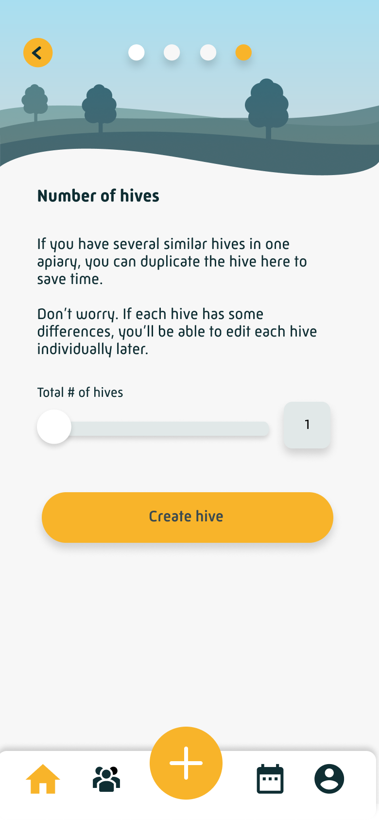
The two screens we removed asked new users to specify their hive equipment setup, queen information, and other configuration details before they'd done anything in the app. This information matters, but not yet. We moved it out of onboarding entirely, making it available to complete from the profile later. The result was a dramatically shorter path to the home screen, with no meaningful loss of data.
Redesigned onboarding flow, as it exists in the app today
Welcome
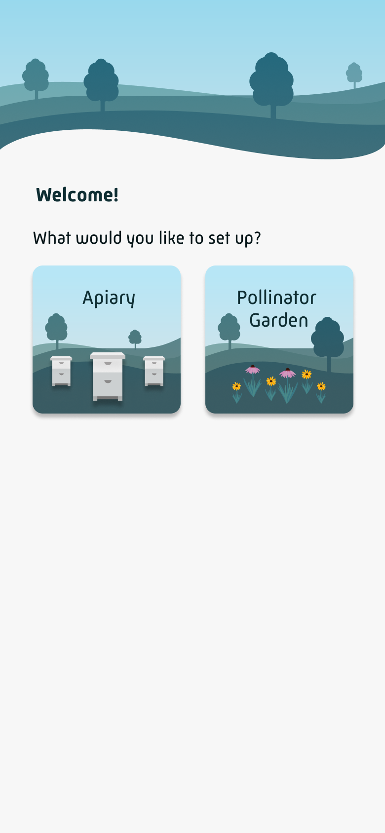
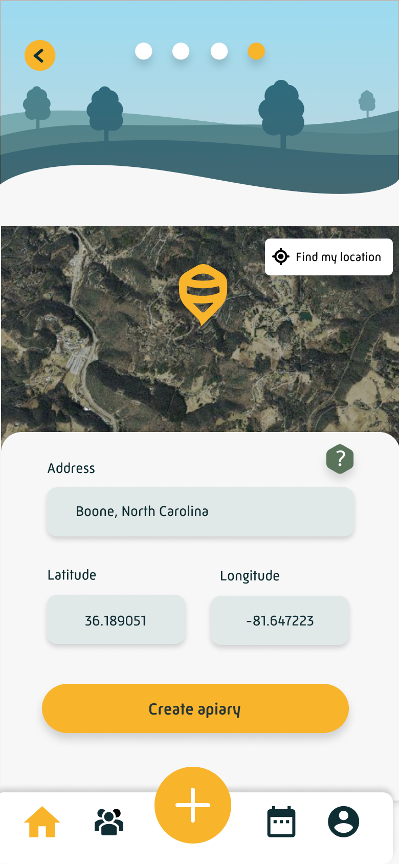
Apiary Setup
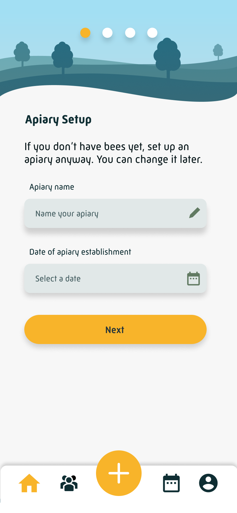
Environment
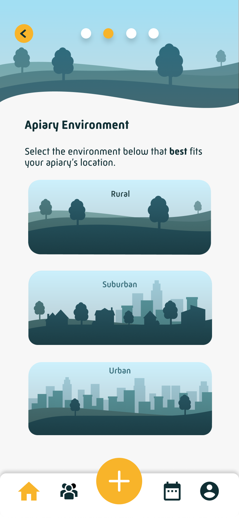
Terrain
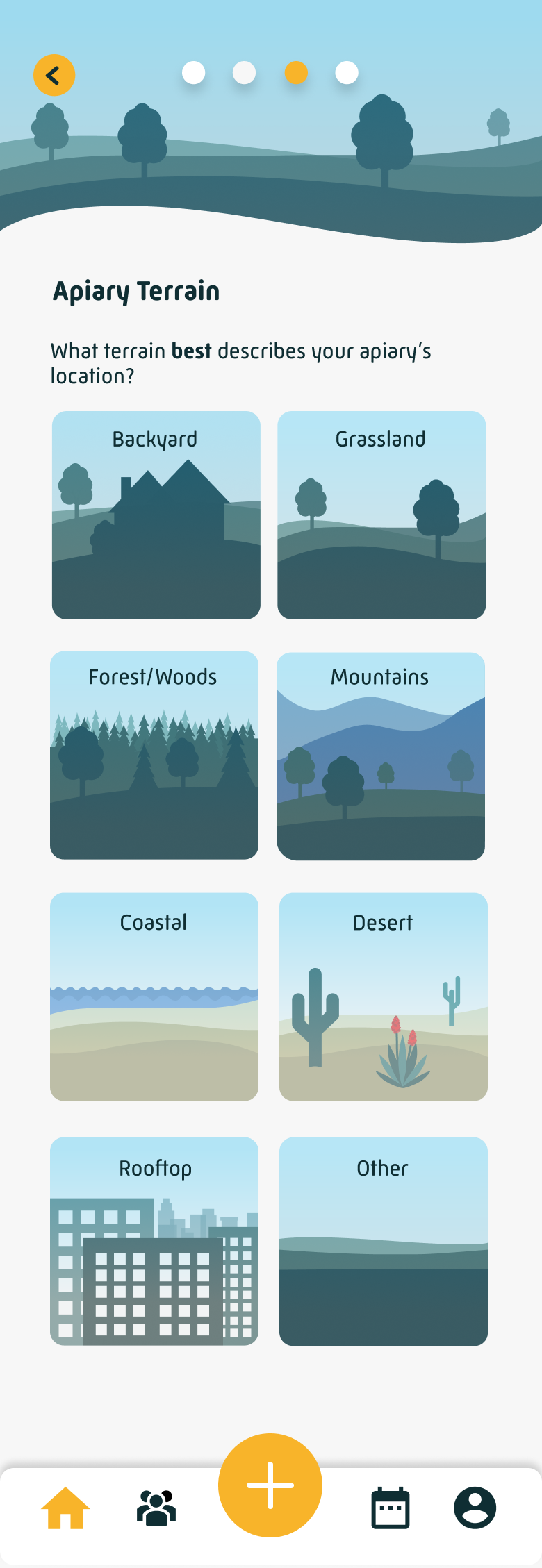
Location
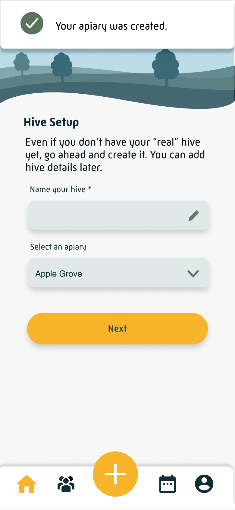
Hive Setup
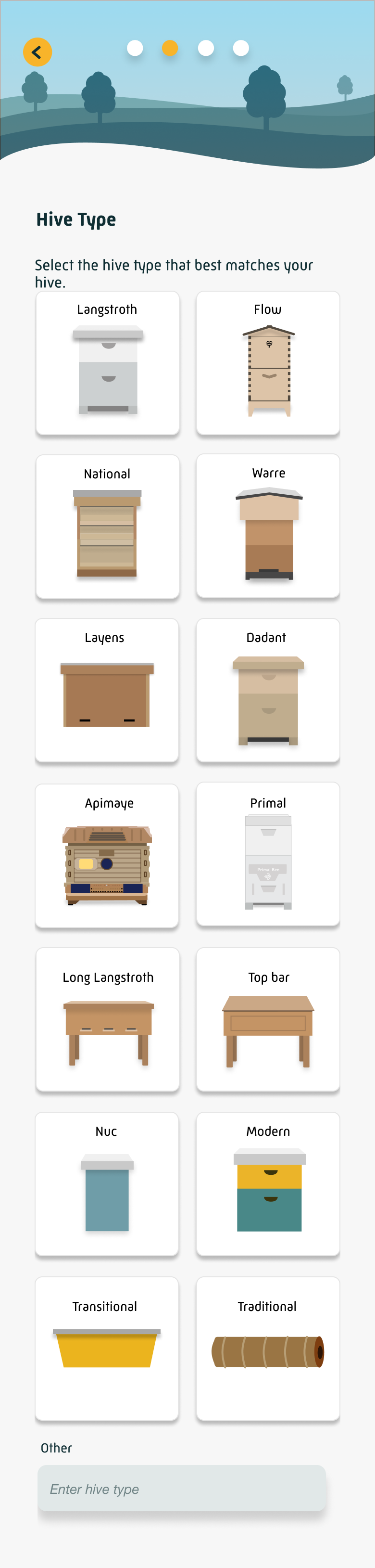
Hive Type
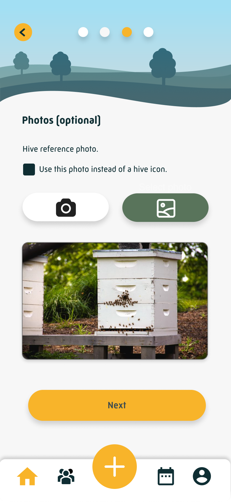
Photos (optional)
Number of Hives
2. Redesign the home screen CTAs to guide users toward value
Getting users through onboarding faster only helped if they knew what to do once they arrived. We redesigned the home screen CTAs to give new users a clear, prioritized set of next steps: try an inspection (the app's most important feature), create a to-do, and complete their profile. The inspection CTA was made the most prominent, because getting a beekeeper to perform their first inspection, even a simulated one, was the closest thing we had to an "aha moment."
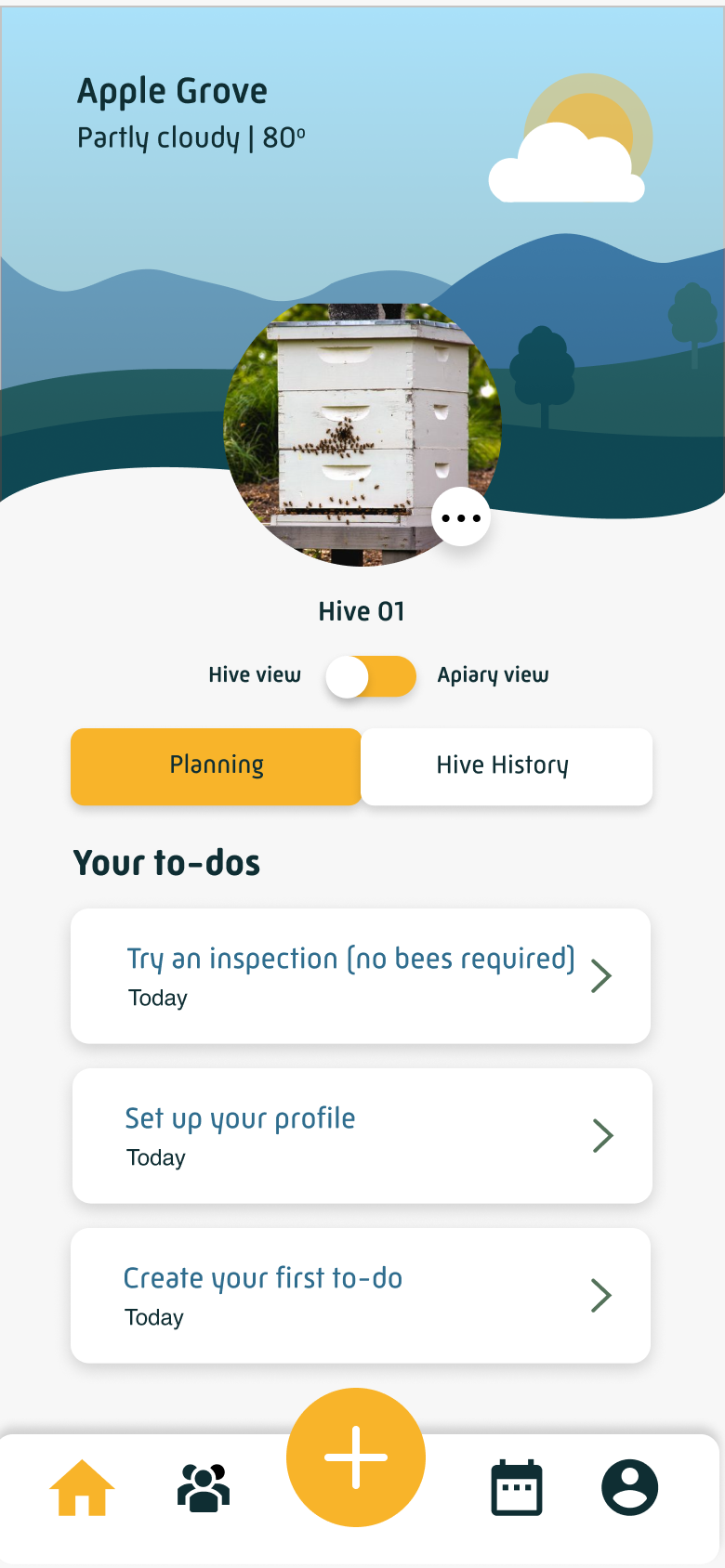
The redesigned home screen greets new users with three clear next steps, inspection front and center.
Together, these two changes shifted the experience from a front-loaded setup process to something closer to an invitation: get in quickly, and we'll show you what to do next.
Results
The key metric was simple: how many users who set up their apiary went on to complete their first hive setup? Before the redesign shipped in early April, that step was losing roughly 37–45% of iOS users and 35–40% of Android users every week. In the weeks immediately following launch, churn dropped to as low as 7.6% on iOS and 9.2% on Android.
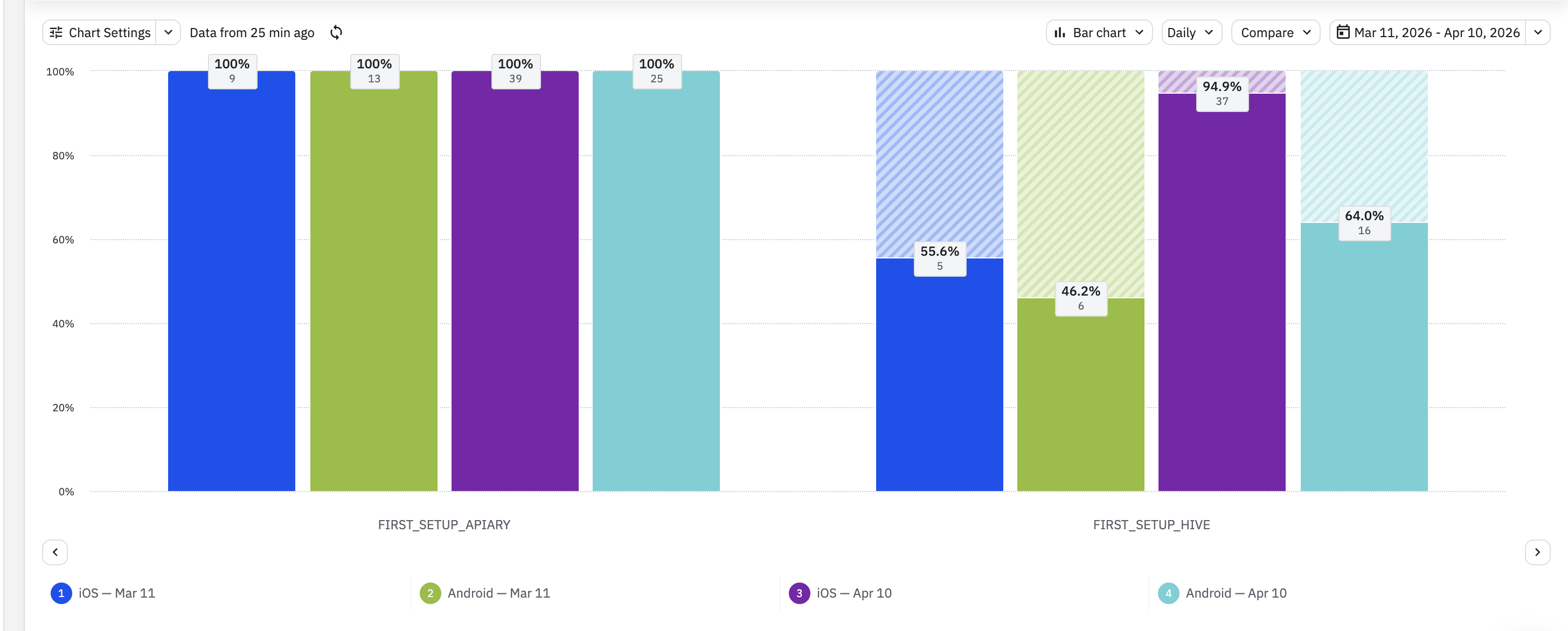
The 60-day average, a more stable measure of sustained impact, settled at 78.7% completion on iOS and 71.9% on Android. The rolling 90-day average churn fell from 35% to 25% and held there.
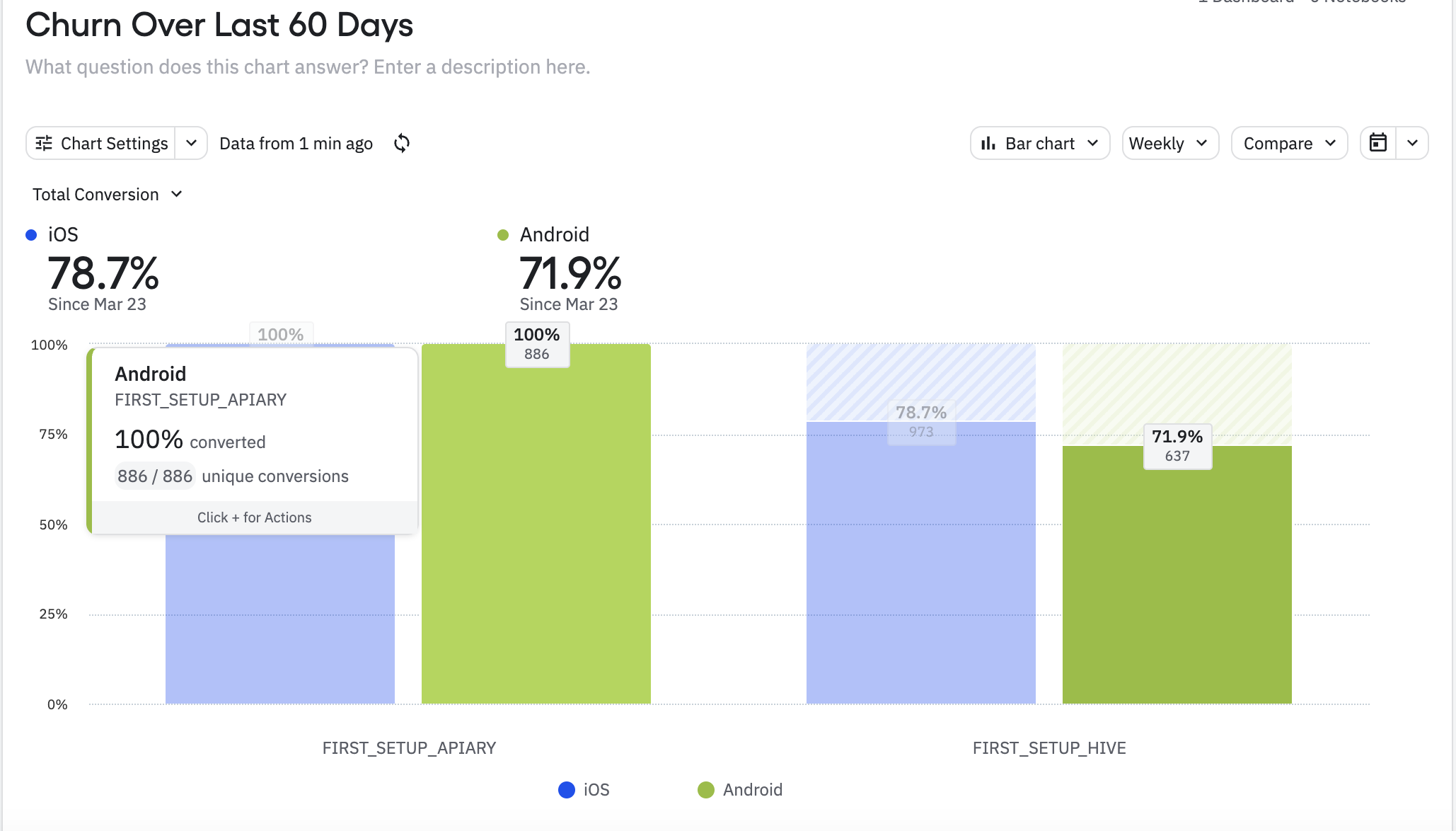
The 60-day average reflects a meaningful and sustained improvement. Churn fluctuated week-to-week through May, as it typically does, but the rolling 90-day average held steady at 25%, down from 35% before launch. Getting users from hive setup all the way through to their first inspection remains the next step worth measuring.
What I Learned
Sometimes the right move is to act on clear signal rather than wait for a perfect research process. The CEO's direct observation, combined with years of consistent drop-off data, was enough to define a focused hypothesis and test it. The result validated that approach.
This project also reinforced something worth remembering about onboarding: removing a question doesn't mean the information stops mattering. Queen details, hive equipment, setup specifics, beekeepers care deeply about all of it. The insight wasn't that we were asking the wrong things, it was that we were asking at the wrong moment. A new user who hasn't yet seen what the app can do for them will experience those same questions as friction. The same user, two sessions in, will experience them as useful. Placement in the flow changes everything.
The more interesting lesson came after launch: improving one step in a funnel reveals the next one. Getting more users through hive setup just made the drop-off at first inspection more visible. That question, how do you get a new beekeeper to actually perform an inspection?, became the starting point for the next project.
Try HiveTracks free
Free to download — walk through the redesigned onboarding flow yourself in under a minute.

On a laptop? Scan a QR code to download →